Three-Piece Framed Wall Art for a Warm Living Room
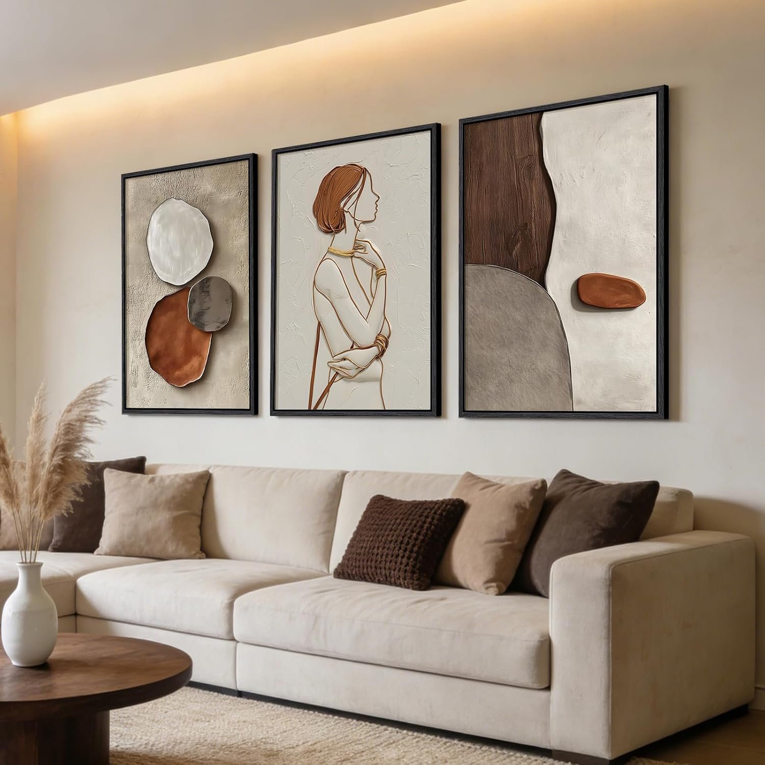
Wall art can change the balance of a living room very quickly, especially above a sofa where a large blank wall can make the whole space feel unfinished. This three-piece framed set brings in warm brown, cream, grey and black tones without making the room feel busy.
The trio has enough scale to create a proper focal point, while the slim frames keep the overall look clean and structured. It feels decorative, but still restrained enough to work with neutral upholstery, timber furniture and softer layered textures.
As an Amazon Associate, I earn from qualifying purchases.
Why it works in a living room
A three-piece arrangement works particularly well above a sofa because it fills the wall without relying on one oversized canvas. The repeated shapes create structure, while the warm neutral palette helps the artwork sit comfortably with wood, linen, boucle and other softer living-room materials.
The mix of abstract forms and the central figure gives the set enough personality to hold attention, but the colours stay muted enough that it should not overpower the rest of the room. That balance makes it easier to use as a focal point without redesigning everything around it.
What it feels like to live with
The slim frames give the set a light, tidy presence on the wall, so even though the three pieces cover a generous area, they do not feel especially heavy or bulky.
The warm brown and cream tones soften the room visually, while the darker details add enough contrast to stop the artwork feeling washed out. From across the room, the set reads as one balanced composition; up close, the different shapes and figures give the wall a little more depth and interest.
Because the palette is fairly restrained, it should be easy to live with alongside neutral sofas, timber furniture and textured cushions without the artwork demanding all the attention.
The drawbacks
Wall art is always more personal than a practical home product, so the biggest compromise here is taste. The central figure gives the set more character than a purely abstract trio, but that also means it may not suit everyone or every decorating style.
The three-piece format also needs enough wall width to breathe. Hung too close together, the set can feel cramped; spread too far apart, it loses the sense of being one composition. It will work best above a reasonably wide sofa or sideboard.
The colour palette is warm and versatile, but it leans contemporary. In a very traditional room, the graphic shapes and slim framing may feel a little too modern.
And although the staged photography is attractive, printed canvas art can look flatter in person than it does online. If you want visible brushwork, heavy texture or the depth of an original painting, this is unlikely to give you that same tactile finish.
Who it suits best
This set suits a living room that needs a stronger focal point without introducing very bright colour or heavy ornament. It works especially well above a sofa, sideboard or console where three coordinated pieces can give the wall more structure.
It will appeal most to someone who likes warm neutrals, contemporary shapes and artwork that feels decorative without becoming too loud.
If you prefer traditional landscapes, very minimal monochrome art or something with obvious hand-painted texture, this set may not be the right fit.
Is it worth making room for?
If you want to give a living room wall more presence without filling it with very bold colour, this three-piece set strikes a useful balance. The warm palette adds depth, while the slim frames keep the overall look clean rather than heavy.
The main compromise is that artwork is highly personal, and the central figure gives this set a more distinctive character than a purely abstract design. It also needs enough wall space to be hung with the right proportions.
For a contemporary living room with neutral furniture and natural textures, though, it offers an easy way to create a stronger focal point without making the room feel overdone.